Wednesday, February 13, 2013

Mildly Creepy

Creeptastic, right?
 Our next big assignment in my Narrative class is to create a mini book dummy for a children's book version of Alice in Wonderland, which in this case means designing 16 pages.  Thankfully, they don't all have to be finished illustrations, so I get to experiment with doing value compositions.  This was much more fun than I thought it would be (and by the way, if you ever need help designing compositions, check out Framed Ink by Marcos Mateu-Mestre.  Molto bene.

Two page spread here.  Am I the only one who thinks that aspen trees look like they're covered in eyes?
Staying in the realm of things that are slightly creepy, I did finish that color study from last time.


I'm still awaiting the day when I'll finish a piece and like everything about it.  As usual, I like parts of this one, but other parts really need changing.  I did take this piece from start to finish in less than 48 hours, though, so I wasn't expecting too much.  Sometimes you're just happy to get an assignment turned in on time, you know? ;)

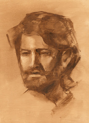
Next week, expect a ton of character design work, because that's what's due on Monday.  Until then, here's a portrait that I accidentally spent several hours on yesterday:


Also, here's a pig girl:

And that's all I have for now.  Peace out, bros.

Monday, February 4, 2013

Neverland and Watercolor

Seems like it's about time to post some art again!  Here, have some Peter Pan:

 
I kind of liked the colors on this one :)

In an effort to make my artwork look more natural, I've started using watercolor on most of my assignments and taking it into Photoshop afterwards to touch it up.  The Peter Pan assignment was my first attempt at this, and though I liked doing it a lot, I decided to push it further.

This was my second attempt:


This is just a portion of an unfinished assignment, but I really loved the effect I got with this one.

I've been drawing a lot of inspiration from Justin Gerard and Jon Foster this semester, so definitely check them out if you want to see some awesome art.  Also, because I'm kind of excited about it and I haven't posted much recently, here's a color study of my current project:


This is a very rough stage of my process where I'm working out the basics of composition and color problems.  The final will probably end up looking a lot like this, but details still might change.  This assignment is due this week, so I should be able to post the final in a few days.  I also have some character design work that I'll post as soon as it's colored.  Until then, see ya!

Monday, January 7, 2013

Final Projects

Yeah, it's a bit weird to be posting my final projects from last semester on the first day of the new semester, but with so much coming up this semester (and hopefully a more frequent posting schedule), I figured I'd better get this out of the way. ;)

Without further ado, this was my final project for my concept design class:

Digital Illustration
A story moment from the Uglies!  I have a little more work to do on it, especially if I decide to enter it into any competitions, but I figure it's fit enough to show.  I've actually had a few people recognize this scene from the book without even being told that it was an Uglies illustration, so that was kind of gratifying. :)

And this was my poster for Richard III that I did for Narrative:

Oil painting, 18"x24"
This one also needs some work, but I'm so done with it right now that I don't know if I'll bother.  I learned a bit painting it, though, so that's always nice.

Finally, there's this piece from Narrative 1, which is definitely a fixer-upper:

Mixed media
My teacher really liked the composition, so I'm considering redoing it and painting a sort of border around it.  Funny story about this piece--it used to be twice as wide, with a whole other segment to the painting, and my teacher didn't like it so much.  When I went in to ask her how I could fix it, she looked at it for a minute, took a pair of scissors, and cut it in half.

"There," she said.  "Now it's an A."

No arguing with that.

Wednesday, October 3, 2012

Prop Design


 In my concept design class this semester, we're pretty much entirely focused on making artwork for Uglies, a book by Scott Westerfeld which is amazing and everyone should read it and ... ahem.

We started out designing props, and these are my final renderings.  I might rework the hot air balloon at some point, but I liked how the hover board and wrist cuffs came out.  So did my teacher, actually.  It's always a nice feeling to get positive critiques XD

Sunday, September 30, 2012

My Life is Ducks (A 3-panel Story)


My life is ducks.  Like... seriously.

In my narrative class, our very first activity was to spend 3 hours sketching a realistic duck.  We spent the next class period doing gesture drawings of the duck from every direction, and the next class period drawing ducks with different facial expressions.  Our final assignment was to draw three panels in black and white depicting a story that had to do with ducks in some way... but by the time this came around I was thoroughly sick of ducks, and since drawing kids seems to be my default, this is what came out.

I handed this assignment in a week ago, but ducks continue to haunt me.  One of my friends now calls me "duck" as a nickname, and another friend texted me a picture today of duck cookie cutters she found at Walmart.  It's just... ducks.  Ducks everywhere.  I can't escape.


...Ah well.  I guess there are worse animals to haunt me for the rest of my life than ducks.

Friday, September 21, 2012

Imprimatura

40-minute value study
Second post! That makes this blog official ;)

I was going to take portrait painting from Chris Thornock this semester, but in the end I had ZERO time for it, so I had to drop the class. I did manage to get a fairly nice imprimatura out of it before I left, though.  It was my first time picking up oil paints since April, and my first head study since way before that, so it was kind of fun to get into that groove again, even just for a day.

My teacher showed us this awesome painting ground I'll have to try sometime where he mixes shellac with old painting pigments from the bottom of his turps can. It ends up with a warm grayish color and a lovely texture from being brushed on. I also learned that you can put gesso on watercolor paper and paint oils over that, which for some reason never occurred to me before.  I'm not sure how archival it is, but for the purposes of an illustrator, it's perfect.

I'll have to make sure to take a painting class from Thornock before I graduate, because I honestly can't believe how much I learned from him in just a week.  Why must I be so busy?? ;_;
---
Chris Thornock's website

Monday, September 17, 2012

Influence Map


For my first official post on my brand-spankin' new art blog, I thought it would be fitting to post a recent exercise we did in my concept art class.  The assignment was to create an "influence map" of artists who inspire us to help guide our stylistic development, which I did using this template

I'm already noticing that when I'm stuck on an art piece, looking at this helps me decide what direction to go on.  Plus, it's fun to see all of this art I admire put together like this. :)

Included are:
  • Nicholas Kole
  • Ryan Woodward
  • Richard Schmid
  • Justin Taylor
  • Zhaoming Wu
  • Lawrence Alma-Tadema
  • Shelly Wan
  • Arthur Rackham
  • Hayao Miyazaki
  • Bernie Fuchs
  • Caspar David Friedrich
  • Jake Wyatt
  • Alphonse Mucha
Some are young artists, some are older, and some are dead, but they're all worth looking up. ;)